Design a Network Optimization Tool

How might we fix software usability for better efficiency? 🤔


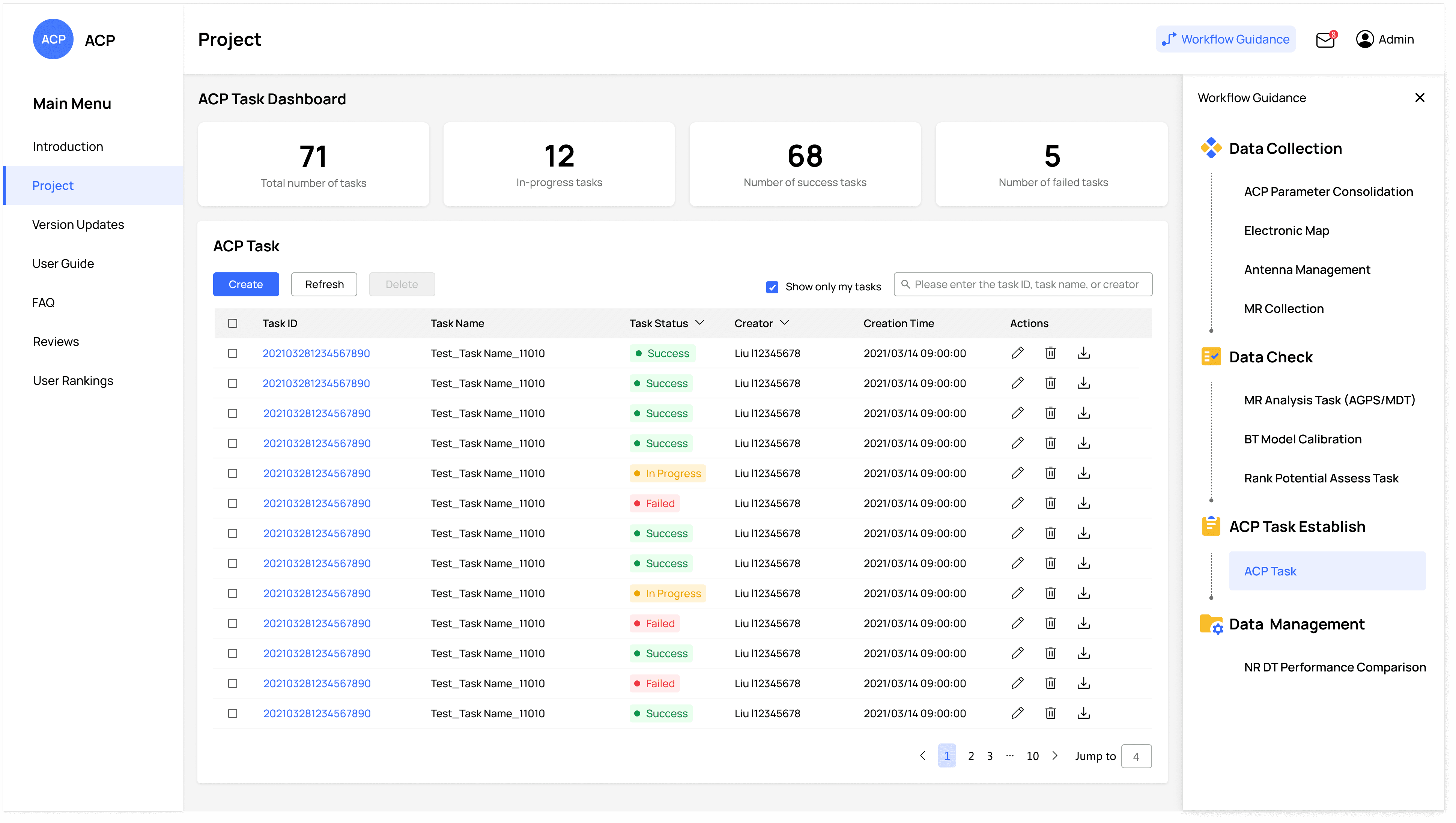
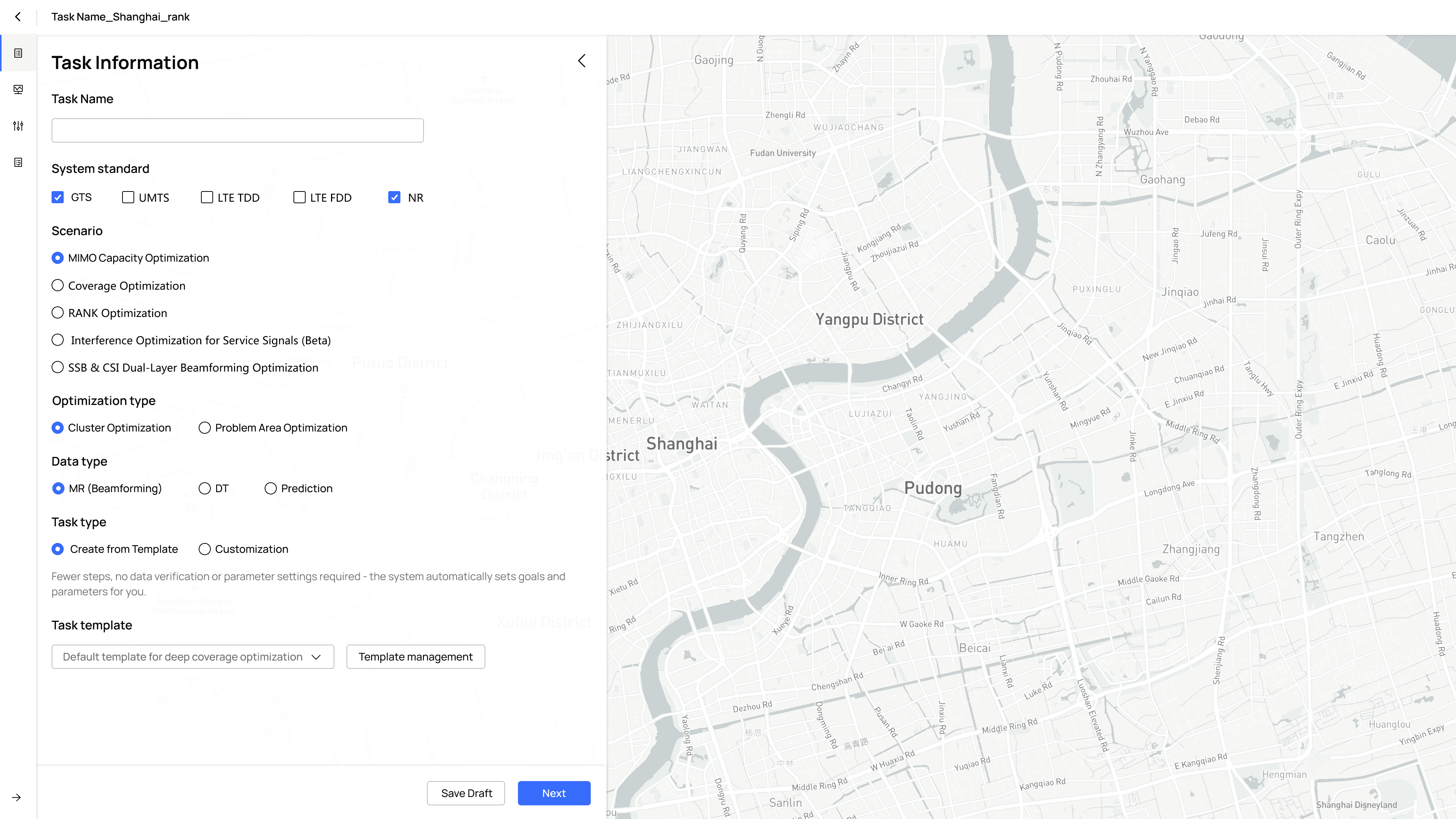

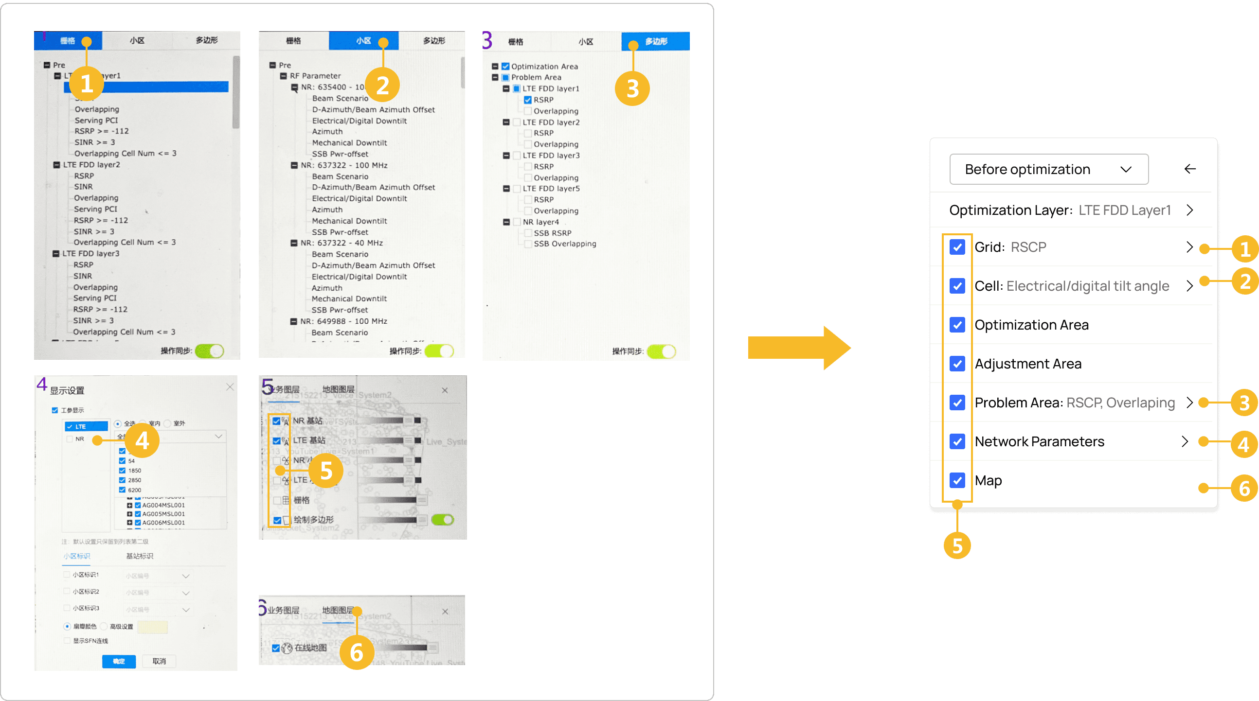

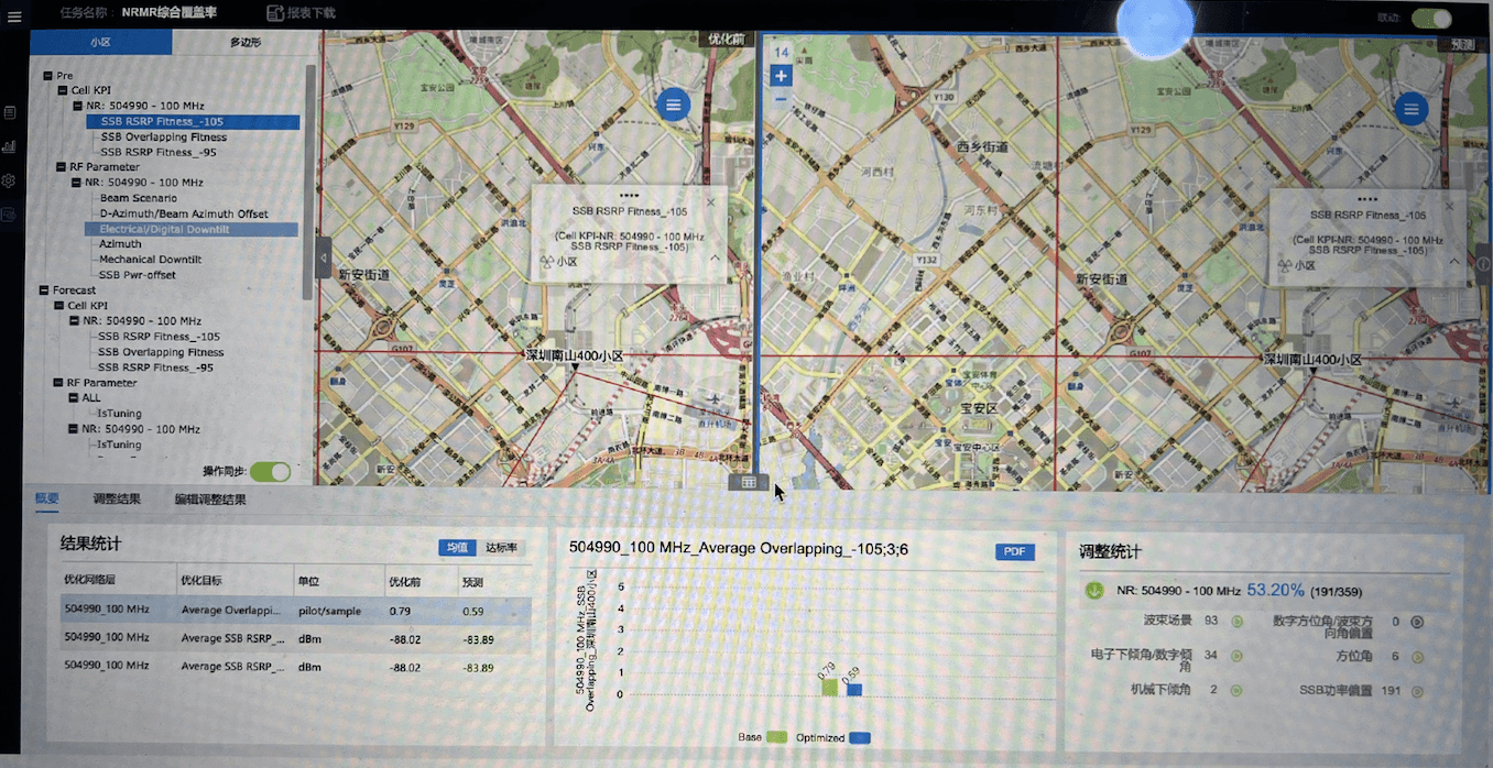
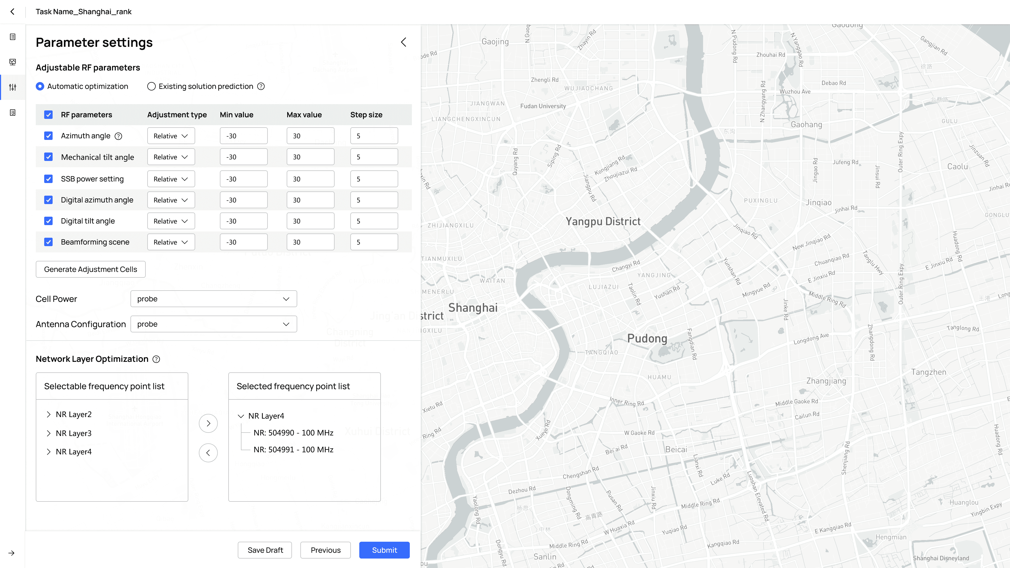
🤯 Before
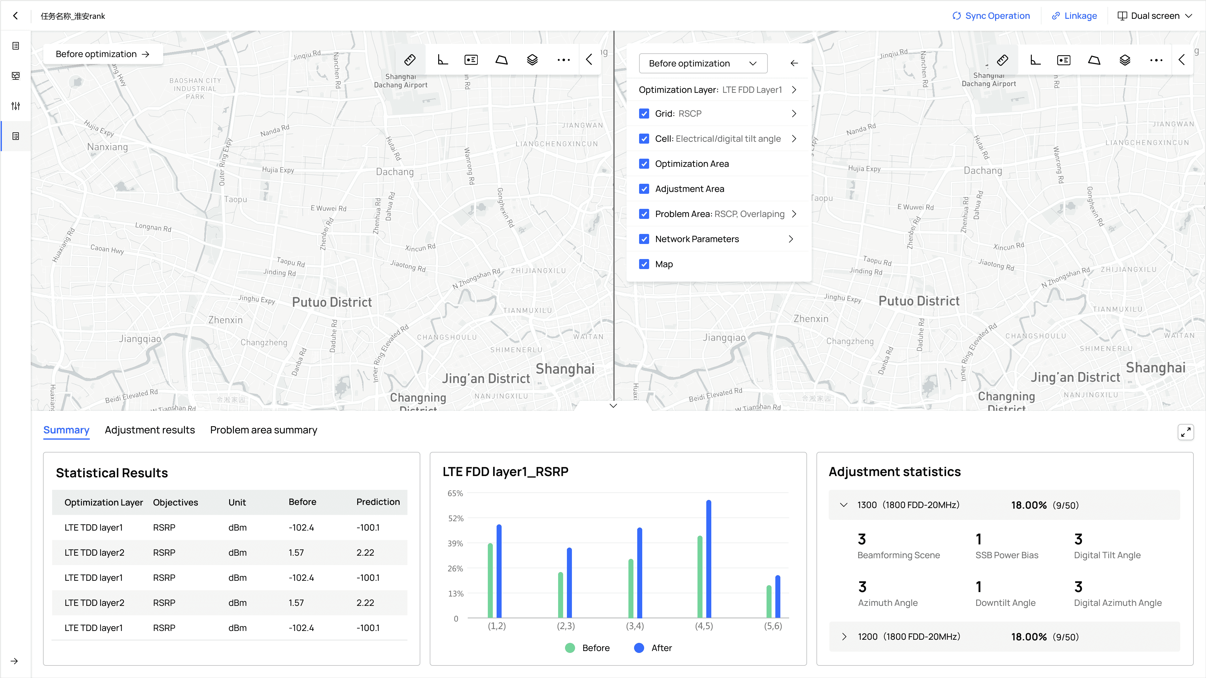
🥳 After
COMPANY
Huawei
YEAR
2021
WORK WITH
1 Product manager, 3 System engineers
6 Software Engineers, 4 Testing engineers
MY ROLE
Research, end-to-end design,
Usability testing
Background
To maintain customer loyalty, telecom operators optimize their networks for improved internet quality. They hire network engineers to do this.
ACP Software: The tool supporting Huawei's 5G expansion
Network engineers 👷🏻 use ACP to address coverage, capacity, and quality issues with data and geographic insights, ensuring good internet performance.
My Team: Huawei Global Technical Service Group 👩🏻💻
2400+
Global Telecom operators
1500+
Networks
170+
Countries and Regions
Problem: Low efficiency complaints from Network Engineers 🤦🏻
We invited more than 30 users to participate in the SUS evaluation.The results were very disappointing, as shown in the picture below:
System Usability Score: Significantly lower than expected
Timeline
The project took 7 months, from identifying the problems to getting signals of success after launch.
Understand the blockers
Talk to actual users
Now that we know the numbers, it's obvious the current experience is terrible, but we’re not exactly sure where the issues are. To dive into that, we interviewed 6 network engineers.

Network Engineer
"I'm having a hard time doing my job! 🤯"
Highlight and group the pain points
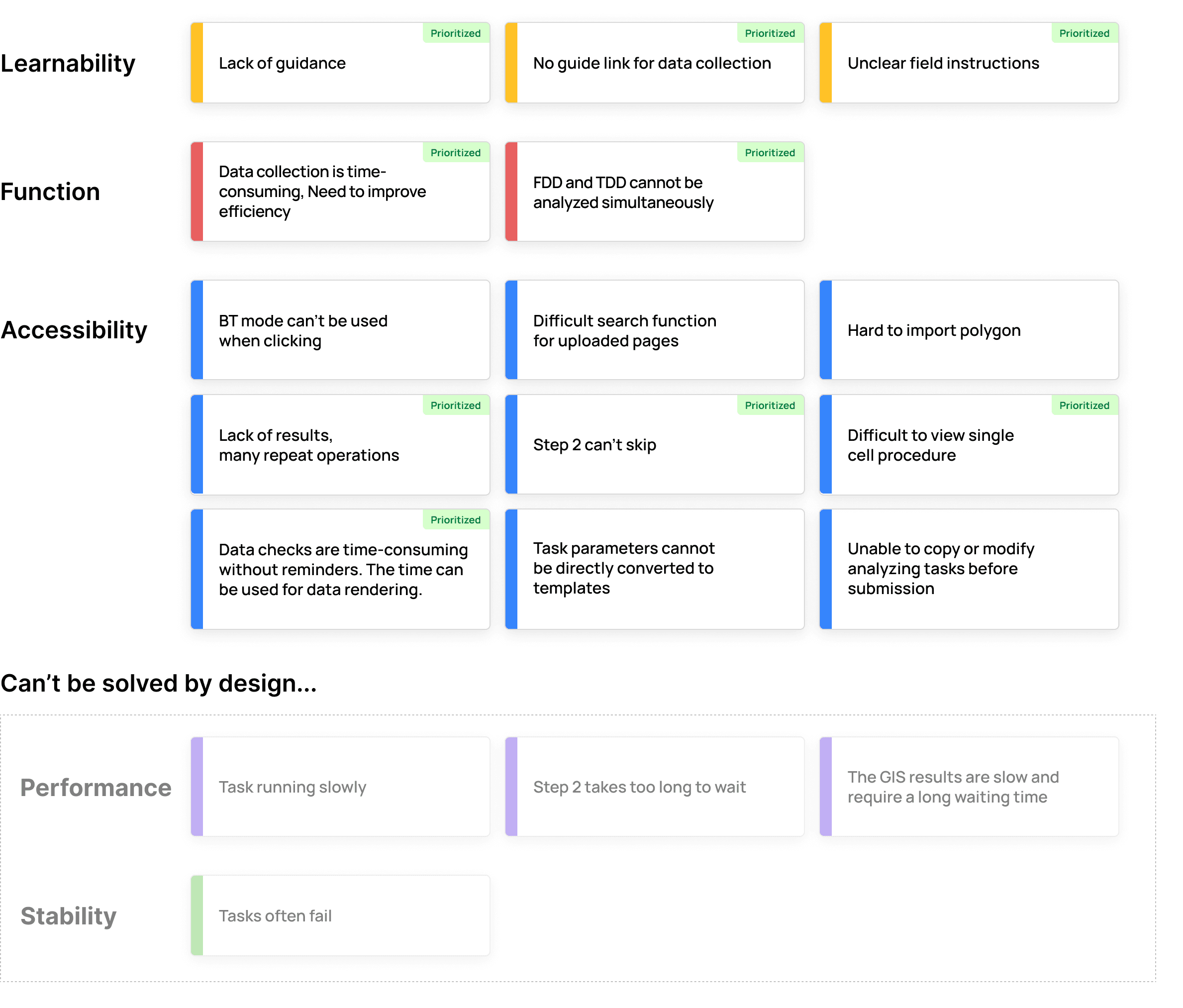
Based on the interviews, I mapped Dan and other engineers' journey, discovering a lot of issues all over the place. For better clarity, I put them into categories, indicated by different colors below:
I got rid of "Performance" and "Stability" issues since they can't be addressed by design. Among the remaining three, I discussed with the team and prioritized the pain points we think will have the most immediate impact.
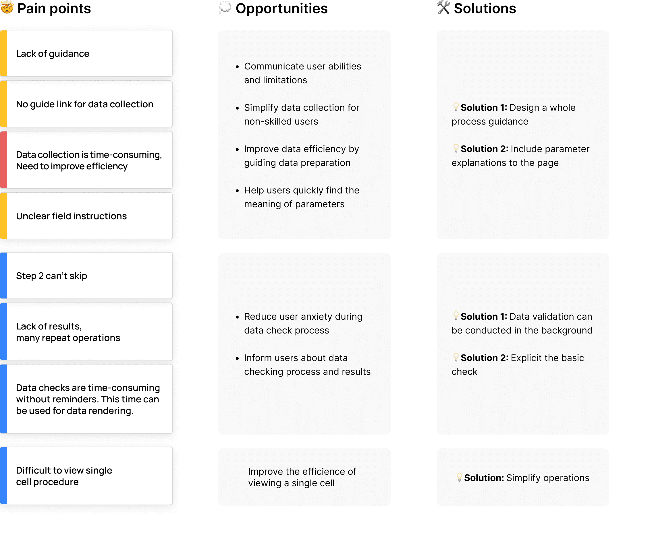
From pain points to solutions, with priorities
From there, I further concluded opportunities from the pain points, and eventually transformed them into potential design solutions.
Design Solutions
1. Instructions made crystal clear 🪞
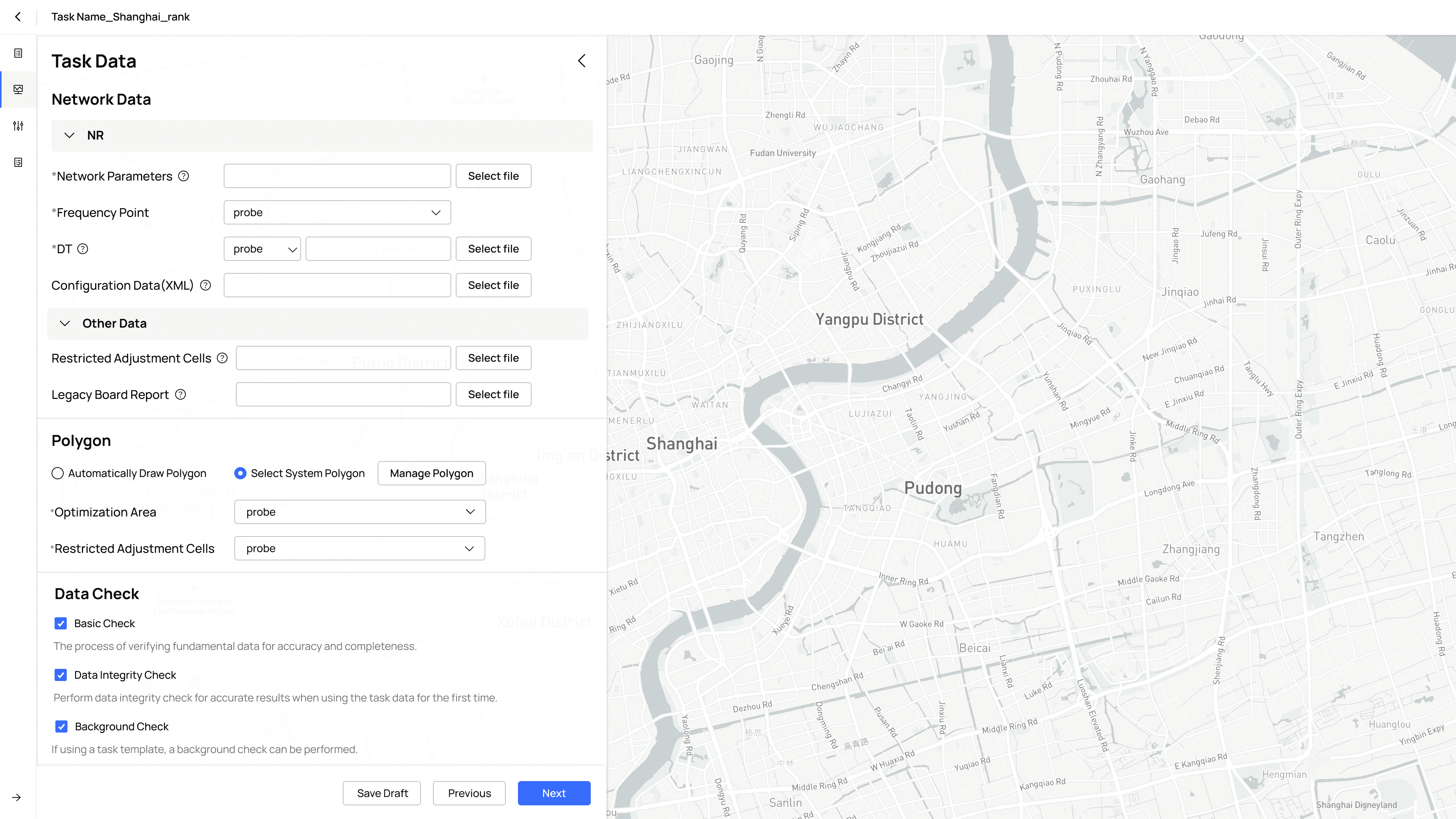
2. Smooth data check without disruption and guessing 📡
📢 Voice of User
“I am new to the software and not sure how to start…”
“I'm not sure about the meaning of some parameters, as well as how to set them.”
⛔️ Problem: Users keep getting lost 🤦🏻
✅ Solution 1: A full guidance for onboarding
A step-by-step tutorial always makes a newcomer feeling safe.
✅ Solution 2: Provide jargon descriptions
Don't know the meaning of a jargon? Don't worry. Simply click and read the description on the fly.
2 . Refinement of task creation process
📢 Voice of User
“Data check is taking forever to complete... can I skip it and do the next thing first?”
“I don't know what's happening on the backend... so frustrating when it's unclear why my attempts are failing.”
⛔️ Problem: Backend tasks forced at the front & no data visibility 🤦🏻♂️
✅ Solution 1: Add "background check" option
If a saved template with known procedures is selected when creating task info, verification will run in the backend and remain hidden from users. No need to wait any longer.
✅ Solution 2: Enhanced data visibility
Prefer not to run verification in the backend and want to see the process? we’ve got you covered. The entire progress now displays details for both failed and successful statuses that were previously missing.
❌ Failed
✅ Success
3. Optimized workflow: less clicks and shorter paths 🪜
📢 Voice of User
“I need to jump back and forth between different places to complete one task.”
“Not being able to see all settings in one view is really annoying…”
⛔️ Problem: Looong paths to finish simple tasks 🤦🏻♀️
Actions once scattered around are now nicely grouped together, requiring only 10 clicks for the core workflow. No more back and forth for a simple task.
✅ Solution: Consolidate scattered actions in a single menu
Implementing refreshed UI
Impact
As the sole designer on the project, I collaborated with frontend engineers to implement the platform's design system in Vue.js. Additionally, I developed comprehensive guidelines outlining best practices and pitfalls to avoid.
Pushing for a Vue.js library parallel to the new design system
SUS score increased from 53.3 in March to 82.1 in December after the GA, based on feedback from 18 users. 10 of them participated in the initial SUS evaluation when the score was really poor.
The service is now available in 28 countries, including China, Romania, Mexico, South Africa, England, Germany, Dubai, Brazil, Morocco, South Korea, Saudi Arabia, Russia, Singapore, Indonesia, Malaysia, and others.
Getting to know the workflows of a specific industry can be tough, but it’s super important for B2B SaaS product designers. Every industry has its own domain knowledge. Understanding these is the only way to create designs that really transform the way people work.
Additionally, even though sometimes data is hard to acquire, it’s essential to set measurable metrics. Using tools like the SUS Score can help you objectively understand how well your designs are working, so you’re making decisions based on concrete results rather than gut feelings.
Reflection
Currently, ACP is deployed in 28 countries, serving hundreds of telecom operators worldwide. 🌍

❌ Failure
Exporting screenshots are not allowed on Huawei's Work PC. Sorry for the blurry photograph 😭
Huawei is a leader in communication solutions, providing telecom operators with network devices, cloud software, and technical support. We have a strong global precense, serving:

